

Building Better Communities
Design and type treatment for a story in the immigration issue of Enterprise Magazine. Translated into different languages and set into the shape of their respective countries—closely nested together to form a sort of an imagined continent.
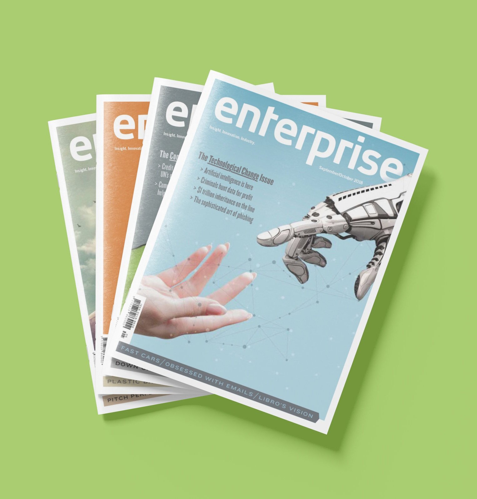
Enterprise Magazine
A collection of editorial stories conceived and designed for the Canadian Credit Union Association’s national publication, Enterprise magazine.

Lean In
Design for an editorial story of credit unions that are adapting “lean” principles [first developed by Toyota] as a strategy to better support those who work on the frontlines

Creative Pursuits
Hand lettering for an article on how credit unions across the country are undertaking creative collaborations.
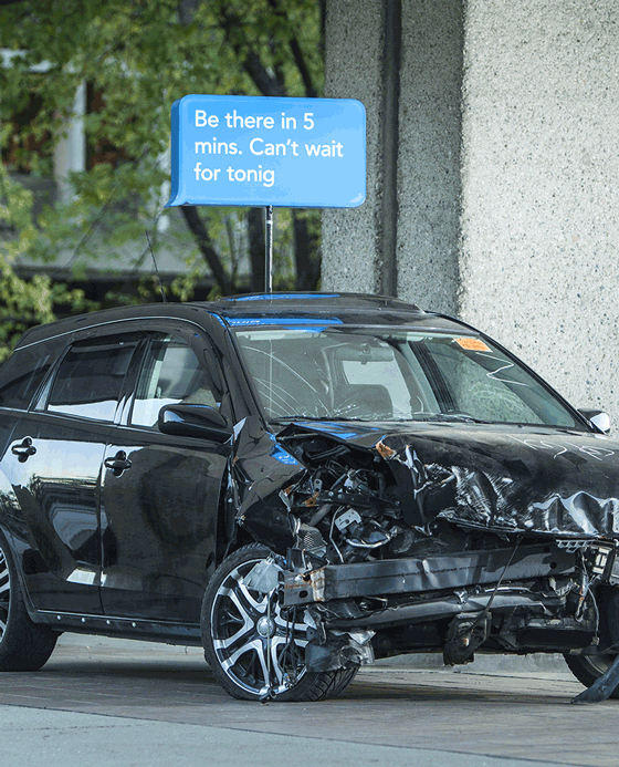
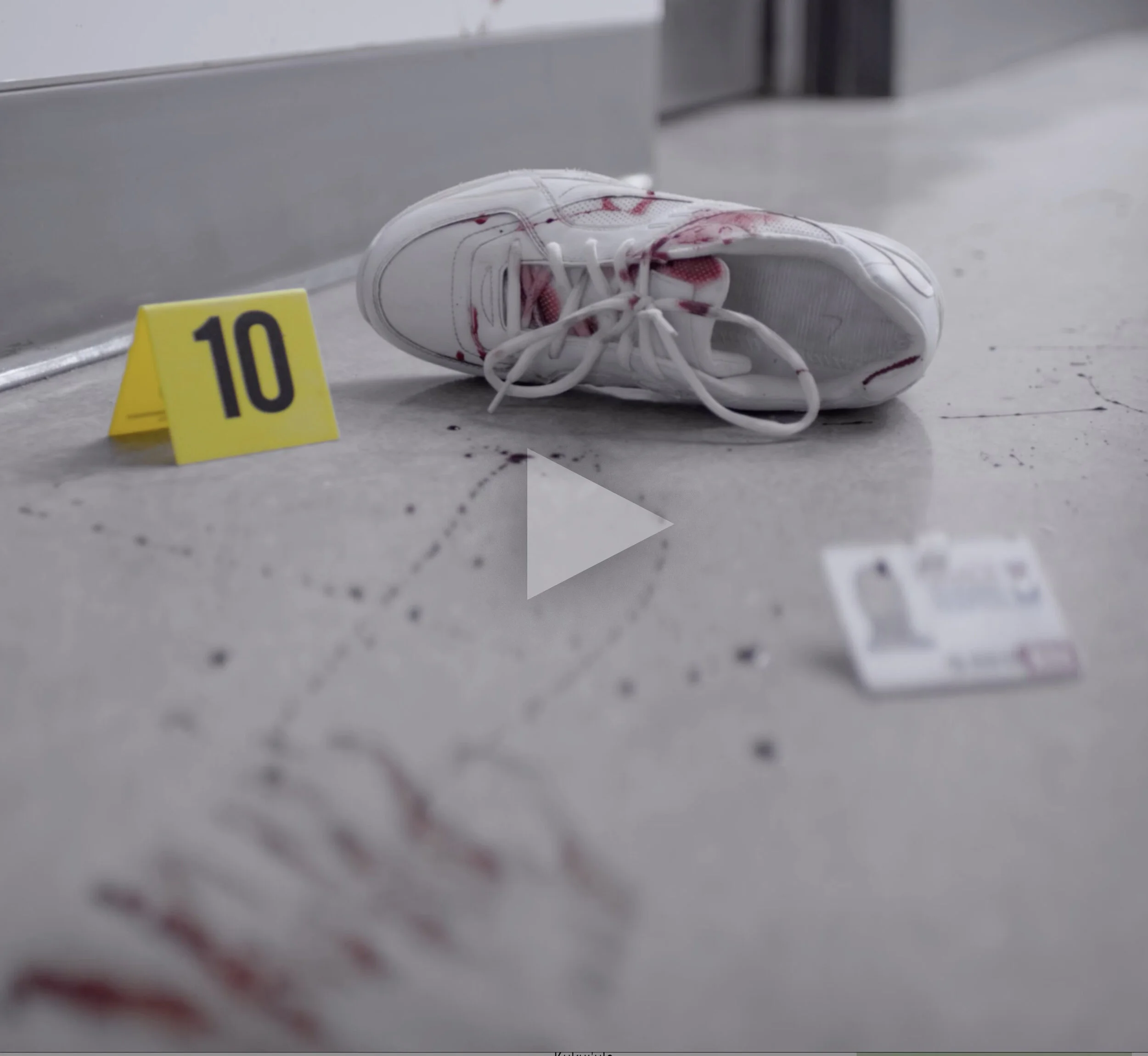
Distracted Driving
Estimated one-in-four death on BC roads involves distracted driving. This on-campus installation planned to reduce those odds by putting students face-to-face with a real-world story.

Majid Khoury Identity
As an advertising research strategist, Majid Khoury takes research data beyond numbers. A system of adjoined brand elements representing connecting data to other available data. Grouping the elements into different clusters interprets their ability to illuminate the data in infinite ways.
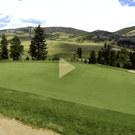
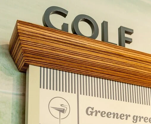
The Voice
If you play golf, you probably know that there are plenty of great golf locations in North America to vacation. All with world class features. So how does one differentiate?
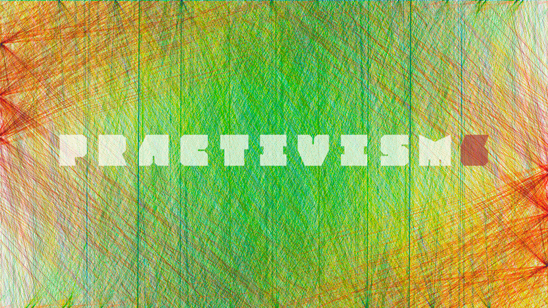
Practivism6
Using a geometric font and represented each element as if it were a data point this designer connected each point with every other point in the text to see what it would look like.
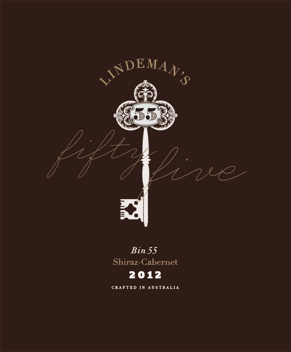
Lindeman's
Keys function to let you in, to unlock everything from a drawing room or a drawer of old letters, to diaries, memories, and unknown stories with new friends over some well-aged hooch perhaps.

The Signal Center
A logo system of 36 unique brain wave segments, each created to represent an alphanumeric character for an Iowa-based healthcare company.
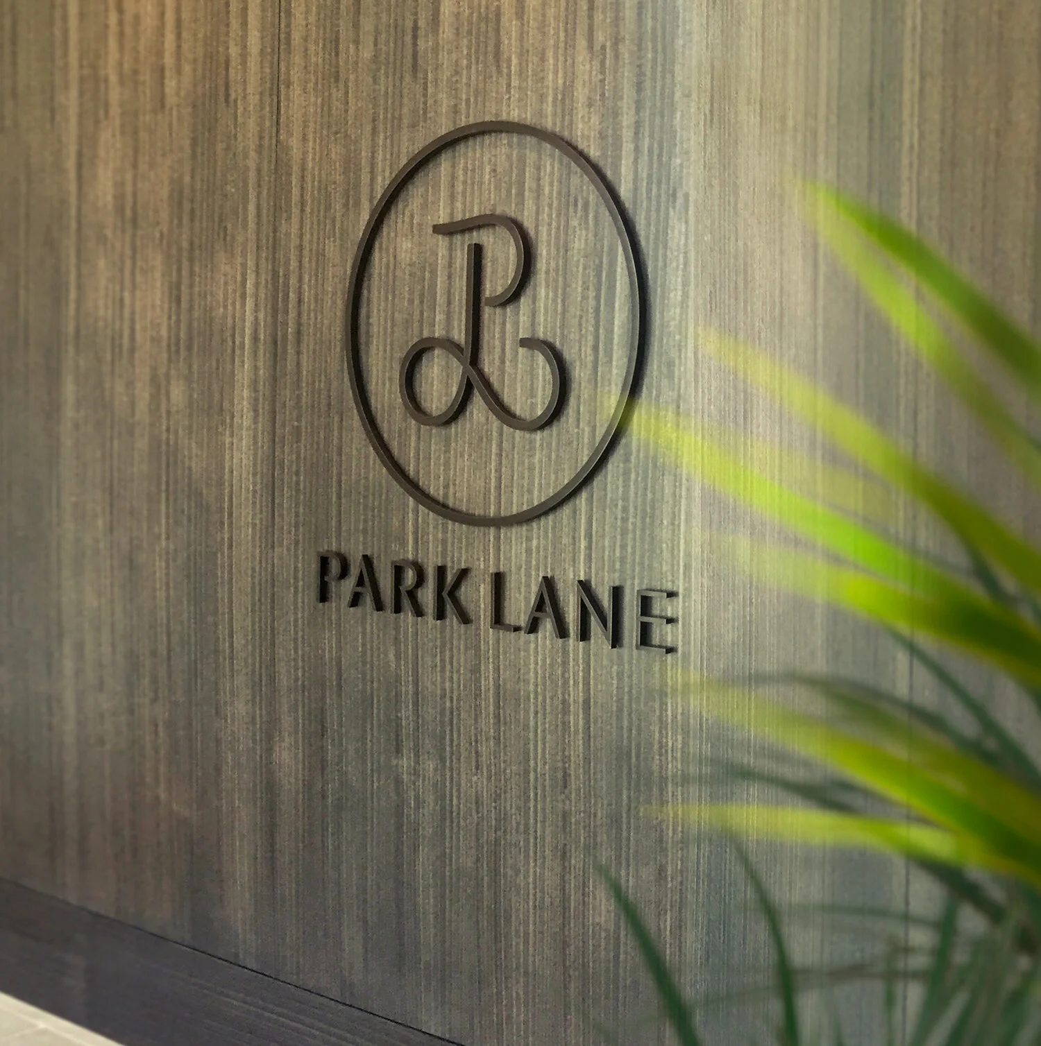
Park Lane | Ala Moana
The result plays on the traditional monogram. A modern, masculine ‘P’ united with a classic, feminine ‘L’. Together with the logotype that is tailored, clean and understated.

Playlist for the Planet
David Suzuki Foundation put together a compilation of the best environmental songs in Canada and asked me to donate my efforts to create the branding.
Help Keep Nurses Safe
These 30 sec spots dramatize real situations that most people never realize occur… that nurses are victims of violence on the job and it’s happening more frequently.
ICBC Branding
Design of a Brand Owner's Manual for ICBC, also a web-based branding bulletin template, a police-partnership brochure, and "Driver Risk" ads.

Kukui'ula
Kukui'ula is a luxury golf community on the island of Kaua'i. It has unique attributes like an inland farm for residences and a family-friendly environment, unusual for a high-end resort.
Tsawwassen Springs
Branding design and presentation centre launch for Tsawwassen Springs golf resort.
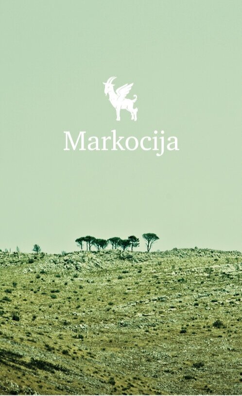
Markocija
Branding for a unique development built on limestone shelves surrounded by medieval buildings with ancient stone walls, vineyards and olive trees.
Graphic Designers of Canada
Using a geometric font and represented each element as if it were a data point this designer connected each point with every other point in the text to see what it would look like.